rm(list=ls())
library(tidyverse)
# load in the dataset
responses <- read_csv('data/responses.csv')5 Working with demographic data
In our dataset we have the the variable gender. Let’s examine what sort of variable gender is.
# What class of variable is gender in the dataset?
print(class(responses$gender))
[1] "character"To work with demographic data we need to convert the variable to a factor. We can do this using the factor function.
# List all the permutations of gender in the dataset
print(unique(responses$gender))
[1] "F" "M" NA responses <- responses %>%
mutate_at(vars(gender), factor, levels=c('M','F'),labels=c('Male','Female'))5.1 What are the proportions of Male / Female in the dataset?
knitr::kable(responses %>%
  group_by(gender) %>%
  summarise(n = n()) %>%
mutate(freq = n / sum(n)), digits = 2)| gender | n | freq |
|---|---|---|
| Male | 1527 | 0.50 |
| Female | 1512 | 0.49 |
| NA | 22 | 0.01 |
5.2 Remove the missing data for simplicity
# Remove the missing data for simplicity
responses <- responses %>% drop_na(gender)
5.3 Now go back to the Test Information and produce a table and a histogram by gender
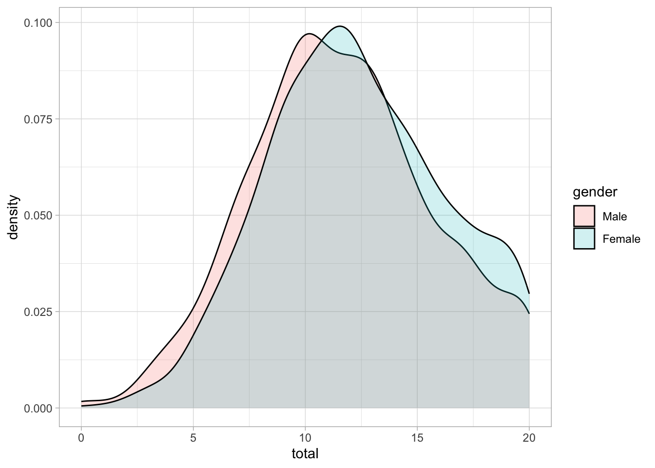
What do you learn from the grouped information?
#| label: fig-histogram
#| fig-cap: Histogram of scores
#| width: 6
#| height: 4
#| include: true
responses <- responses %>% mutate(total = rowSums(pick(ends_with("_score")), na.rm = TRUE))
ggplot (responses, aes(x = total)) +
  geom_histogram(bins = 21) +
  scale_x_continuous(breaks = seq(0, 20, 1)) +
  # add a vertical line at the mean
    geom_vline(xintercept = mean(responses$total), linetype = "dashed", color = "red") +
    facet_wrap(~gender, ncol = 1) +
    # add the light theme
theme_light() 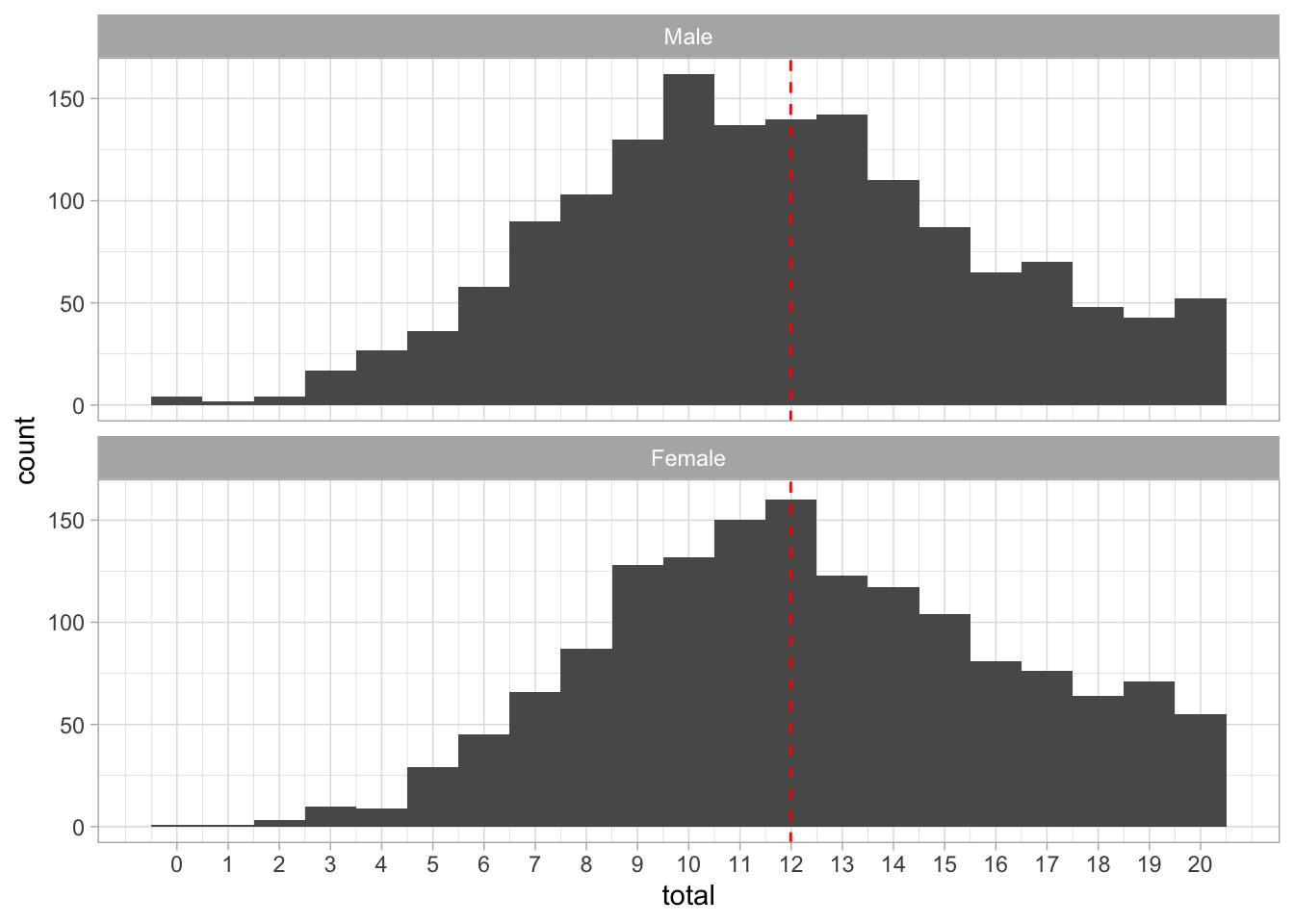
ggplot (responses, aes(x = total, fill=gender)) +
  geom_density(alpha=0.2) +
  scale_x_continuous() +
  # add a vertical line at the mean
    # add the light theme
  theme_light()